My Favorite Interior Paint Colors | Our Whole House Paint Color Scheme
Get my favorite interior paint colors with our whole house paint color scheme! These beautiful paint colors will look gorgeous in any home!
I am definitely not the “handy” one in our house. Donnie is the one who is skilled with tools, building, and fixing things, and therefore, many of the DIY projects around here fall to him.
I couldn’t just leave him with ALL of the work in ALL of the rooms in the house though, so I usually end up doing most of the painting so that I can contribute (and also because I like to switch things up and probably paint more often than I care to admit… 😉 ).
When we moved into our house nearly three years ago, the builders had painted every single wall the same dingy white. I am not opposed to white walls in general, but the particular shade they chose was not my favorite, so I have spent the past few years going room by room, painting them the colors that are my favorites!
After so much painting (and also lots of painting in our last house, whose color scheme was not the best when we moved in), I thought it would be helpful to share the whole house color scheme we’ve come up with using our very favorite paint colors.
How We Choose Our Paint Colors
Before I jump into the exact colors we use in our home, I wanted to do a quick run down of our process for choosing paint colors.
I wish there was a way to walk into the paint section of the store and magically be drawn to the paint chip featuring the color that will be absolutely perfect in my space, but sadly, it rarely (if ever) happens that way.

Paint colors can be fickle; a color that looks amazing in the store on a little chip can end up looking atrocious when covering an entire room. (Not that that’s ever happened to me before… 😉 )
To make sure I have the greatest chance of choosing a paint color that I truly love, I typically follow these steps:
1. Look at lots and lots of paint chips.
I begin my search for a new paint color at the same place most people do– by looking at paint chips. Whether it’s on one of the decks I keep at my house or at the paint store, I start by choosing specific chips that seem to match the aesthetic I’m going for in my room.
I try to look at the chips in several different lighting situations and hold each one up next to other chips of paint colors I use in my home in order to most accurately identify the undertones of each one and find the best fit.
2. Find rooms that use my potential colors.
After I’ve found 5-10 paint chips that look promising, I do a Google image search and/or a search on Pinterest for rooms that incorporate the colors I’m considering.
This helps me to see the paint color in a “real” space, helping me to narrow down my stack of paint chips if a color looks drastically different on the walls than it did on the chip.
3. Grab paint samples and testing sheets.

I have tried to paint rooms without actually trying samples of the colors before, and it rarely turns out well! I am always glad when I take the time to actually see the colors in the room I’m decorating because there are so many factors that can change the way they look.
The lighting in the room (or lack thereof). The surrounding colors in the space (including the color of the trim work). Time of day. So many variables!
I like to make sure I can see how the paint colors look in different parts of the room, so I usually use a removable film like this one to test my samples so I can easily move them around.
4. Check on the potential paint colors throughout the day.
I tend to leave my paint samples up for a few days to that I can check and see what they look like as the light changes in the room throughout the day, as well as how they look in different parts of the space.

5. Get more sample colors if needed.
If none of the colors I tried out are exactly what I’m envisioning, I will repeat the process until I find the paint color I’m looking for.
It can feel tedious to test out so many samples, but I don’t want to have to either repaint or live with a color I don’t love for the long term, so the extra time is worth it!
6. Choose the winner and get painting!
Once I’ve found the color that matches the look I’m going for, it’s time to stock up on paint and start painting!
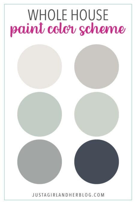
Our Whole House Paint Color Scheme and Interior Paint Colors
Now that you have a quick rundown of how we choose our paint colors, here are the interior paint colors that we’re using in our own home…
Behr Marquee Cameo White MQ3-32
I never thought I would have a “favorite white,” but it turns out that I do– Behr Marquee Cameo White!
It might sound silly, but whites can actually be vastly different from one another depending on their undertones, which can range from yellow to pink to green and more!
Cameo White is not a stark white. It has a creaminess to it that makes it warm and inviting rather than cold or dingy looking.
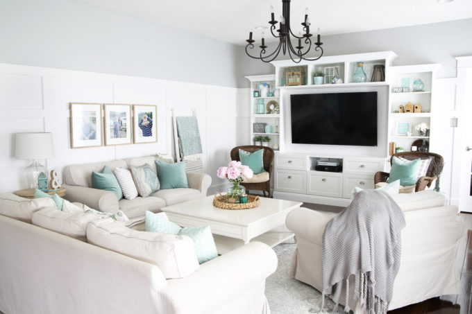
Along with using it whenever we paint any of the trim work in our house, we also used Cameo White for the board and batten in our living room:
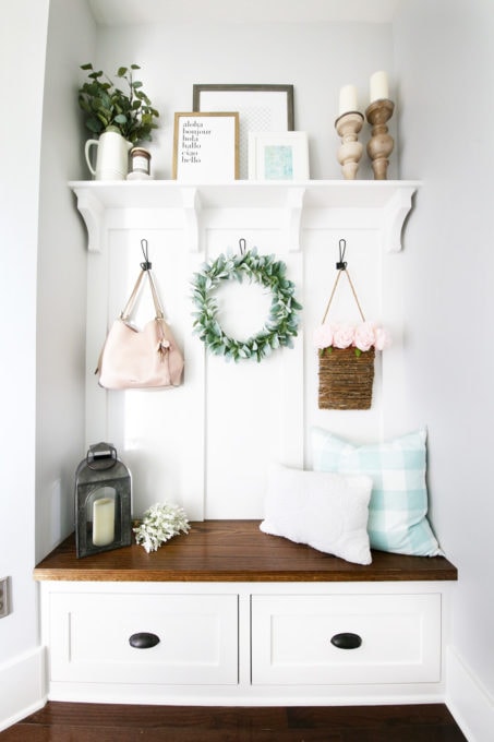
We chose it for the built-ins in our mudroom as well:
Behr Marquee Silver City MQ2-59
Along with choosing a standard white that we use all around our house, I also like to pick a “main” neutral color. We use this color in all of the halls and transition areas in our house and also in many of the individual rooms.
The main neutral color that we use in our house is Behr Marquee Silver City, my most favorite gray. In our house it comes across as a true gray, not tinged blue or brown. I feel like it helps define our spaces and again, makes them feel inviting rather than cold and stark.
Silver City also works well with Cameo White, so we’ve used it to complement the board and batten areas in the living room…
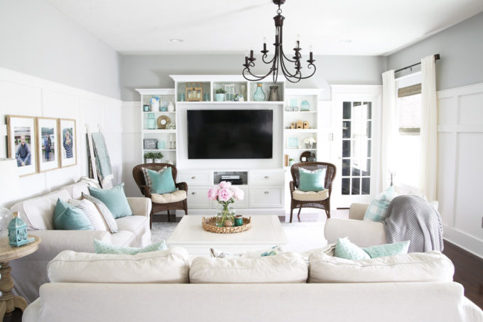
Silver City also flows into the kitchen, which is in the same main living area…

Because I love it so much, I also chose to use Silver City in a few of the bedrooms, including our guest room…
…and our boys’ shared bedroom…

We even used it to paint the garage when we were looking for a neutral background for all of the stuff we were storing in there!

Behr Marquee Silver City MQ2-59 at Half Strength
It took trying out many, many, MANY grays to find the one that was “just right” for us, so when I had a few rooms that I wanted to be a little lighter, instead of starting the paint search over from scratch, I decided to still use my favorite gray, just mixed at half strength.
If you’re not familiar with mixing paint colors at partial strength, my friend KariAnne from Thistlewood Farms has a post that explains it well here.
Basically, I’m having the paint people mix half of the Silver City formula and half white, giving me the same color, only lighter!
I used the half-strength version of Silver City in our sunroom for a light and airy look:

I also used the half-strength version in our mudroom, which doesn’t get much natural light, to keep it from looking too dark and cave-like:

Behr Chain Reaction PPU25-16
Although I love my go-to neutral, sometimes we want to go a little darker and more dramatic, so we chose a separate paint color for that situation, Behr Chain Reaction.
Donnie first chose it for his home office…

…and I loved it so much that I used it in our guest bathroom as well:

Sherwin Williams Rainwashed SW 6211
The aforementioned neutral colors cover the majority of the rooms in our house, but every once in a while even color-shy decorators like me start feeling the need for a little *pop* of color.
In our dining room (which is one of the only downstairs rooms that doesn’t directly flow into another space, therefore making it the perfect candidate for a pop of color), I wanted to incorporate my favorite color, aqua.
But did you know finding an aqua that is not too blue and not too green at the same time is tough?! It is.
I finally found my perfect shade in Sherwin Williams Rainwashed though, and now it makes me smile each time I set foot in the dining room.

Rainwashed works because it has a gray-ish base, so it complements the other colors in our house nicely.
After using Behr Marquee paint, I got so used to its phenomenal one-coat coverage that I now use it every time I paint, so even though I was using a Sherwin Williams color, I went to Home Depot and had them color match it in the Behr Marquee paint. It does cost a little bit more, but it saves me so much time because I only end up doing one coat + a few touch-ups, and it looks beautiful too!
Along with the dining room, I also used Rainwashed in my office nook…

…and on the stenciled feature wall of my office (paired with Behr Marquee Cameo White).

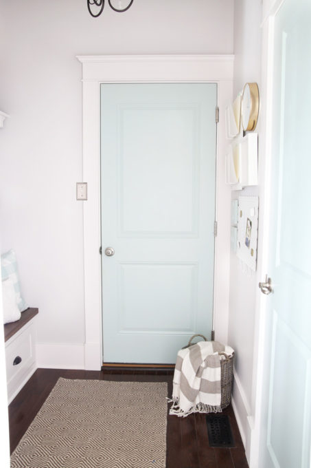
Rainwashed works well as an accent color too! I used it to paint the doors in our mudroom for a fun, unexpected bit of color.
Sherwin Williams Sea Salt SW 6204
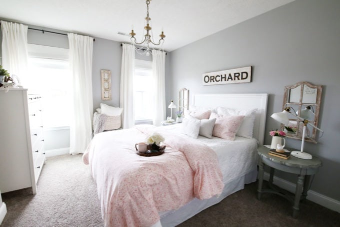
Though I LOVE Rainwashed, I wanted a more calming and muted green-ish color for our master bedroom, and I landed on Sherwin Williams Sea Salt (again color matched in the Behr Marquee paint).

Again it flows well with the rest of the house because of a gray undertone. In fact, Sea Salt is a chameleon and can even look more gray than green in certain lights. (Look at the spot above the window on the right side of the bed– you can definitely see it looking a bit more gray-ish.)
I’ve heard others report that Sea Salt can look everything from minty toothpaste green to almost baby blue depending on light and other colors in the room, so if you’re thinking of using it, you’ll definitely want to try it out in your space first!
Benjamin Moore Hale Navy HC-154
Finally, my boys’ room needed a little bit of extra interest, and a fun stripe going all the way around the room ended up being just the thing!
After trying out several blues, Benjamin Moore Hale Navy won me over with its gray undertone, and I had it mixed up in the Behr Marquee paint to complete the stripe.

So those are my favorite interior paint colors! If you could use even more paint color inspiration, these posts can help:
Townhouse Paint Color Home Tour
My 5 Favorite Gray Paint Colors
My 10 Favorite Aqua Paint Colors
And if you’re looking to learn even more of the color theory behind choosing a whole house paint color scheme, my friend Jackie from School of Decorating has an excellent post about it here.
Remember these pretty paint colors by pinning this post to refer back to later! Pin the image below so you can find it easily!

What are your favorite paint colors to use in your home? I’d love to hear about them in the comments below!
Thanks for following along! Have a great day!

I love the half-strength color trick! I’m also a huge fan of Behr. Since I switched to using quality paint, I’ll never go back. It saves so much time and (I think) money because you do one coat and you’re done!
I totally agree! Behr has been a game changer for us! Have a great weekend, Ashley!
~Abby =)
You have done an excellent job painting all the rooms….can’t decide if my favorite is your bedroom or living room! Wish me luck, I’m about to tackle my bedroom! I chose SW Comfort Gray =) Dreading that dental crown moulding though!
Woohoo! That’s a beautiful color… hope you love it! Have a great week, Miranda!
~Abby =)
Thank you for sharing your color palette, Abby. All of your rooms look gorgeous! I love “sea salt” and have used it in our home. It is interesting how it looks one color at one time of the day and slightly different at other times, especially in the stairway with windows. I’m excited to try “rainwashed”! That sounds like a nice alternative.
Rainwashed is definitely one of my absolute favs! SO pretty! Hope you have a great week, Laurie! <3
~Abby =)
Did you use a paint system or freehand with brush and roller? Also what did you chose for your ceiling color?
I used a roller for most of the walls then cut in with a brush for the trim. Our ceiling is the color our builder chose, which is Sherwin Williams Heron Plume. I hope this helps! Have a great day!
Thank you for this helpful post. I love the idea of continuity throughout a home but usually tend to be more random with paint colors. Your reasoning and examples inspired me to rethink my plan!
Yay! So glad it was helpful for you, Jaimee! Love to hear that! Hope you have a wonderful week!
~Abby =)
So pretty! I love the Sea Salt in your bedroom! I’d love something similar in mine. 🙂
Thanks so much, Katie! We LOVE it! So calming! 🙂 Have an awesome week!
~Abby =)
Thanks for this super helpful post! I went to Home Depot and got samples of Silver City full strength and 66% strength to test out!
Question for you… do you happen to know what white was used on your kitchen cabinets? I was thinking of going with Cameo white for the trim in the house but I’m not sure if that’s a good option for the kitchen cabinets as well. I don’t want a brighter white on the cabinets to make the Cameo on the trim look dingy!
Hi, Corina! Our cabinets are the Rushmore Painted Linen cabinets. We actually painted the back part of our island Cameo White and it looks great with the cabinet color. I hope this helps! Have a great day!
Thank you for sharing your paint colors. We are almost finished building our home and I went with SW Creamy in all rooms because I was just too overwhelmed by all the other things I had to pick out that I decided paint could wait. We know we want grey tones along with some calming pops of color once we get moved in. This is very helpful to get us started!
Yay! So glad it was helpful for you, Shannon! And I completely sympathize… there are SO many decisions to make when building. Definitely overwhelming! Hope you’re enjoying the process! 🙂
~Abby =)
It’s fascinating how you have used the same color in different rooms but it looks like a completely different paint. Good tip about checking in throughout the day on the samples. Different light definitely effects the overall appearance.
So glad it was helpful for you, Jessica! Have a wonderful week! <3
~Abby =)
I LOVE these colors!! Might steal them for my renovation! Thanks for the tips.
Thank you so much, Megan! Best of luck with your renovation!
Swooning over your color choices <3 Your home is beautiful!!
Great photography also. Reminding me of my old house, which was a huge renovation project. Interestingly I also found a fav white and paired it with a platinum grey that was mixed with white to lighten it… the wood panels in cream white with the light grey walls and dark wooden furniture was beautiful.
Sounds beautiful, Alex! Hope you’re having a wonderful week! <3
~Abby =)